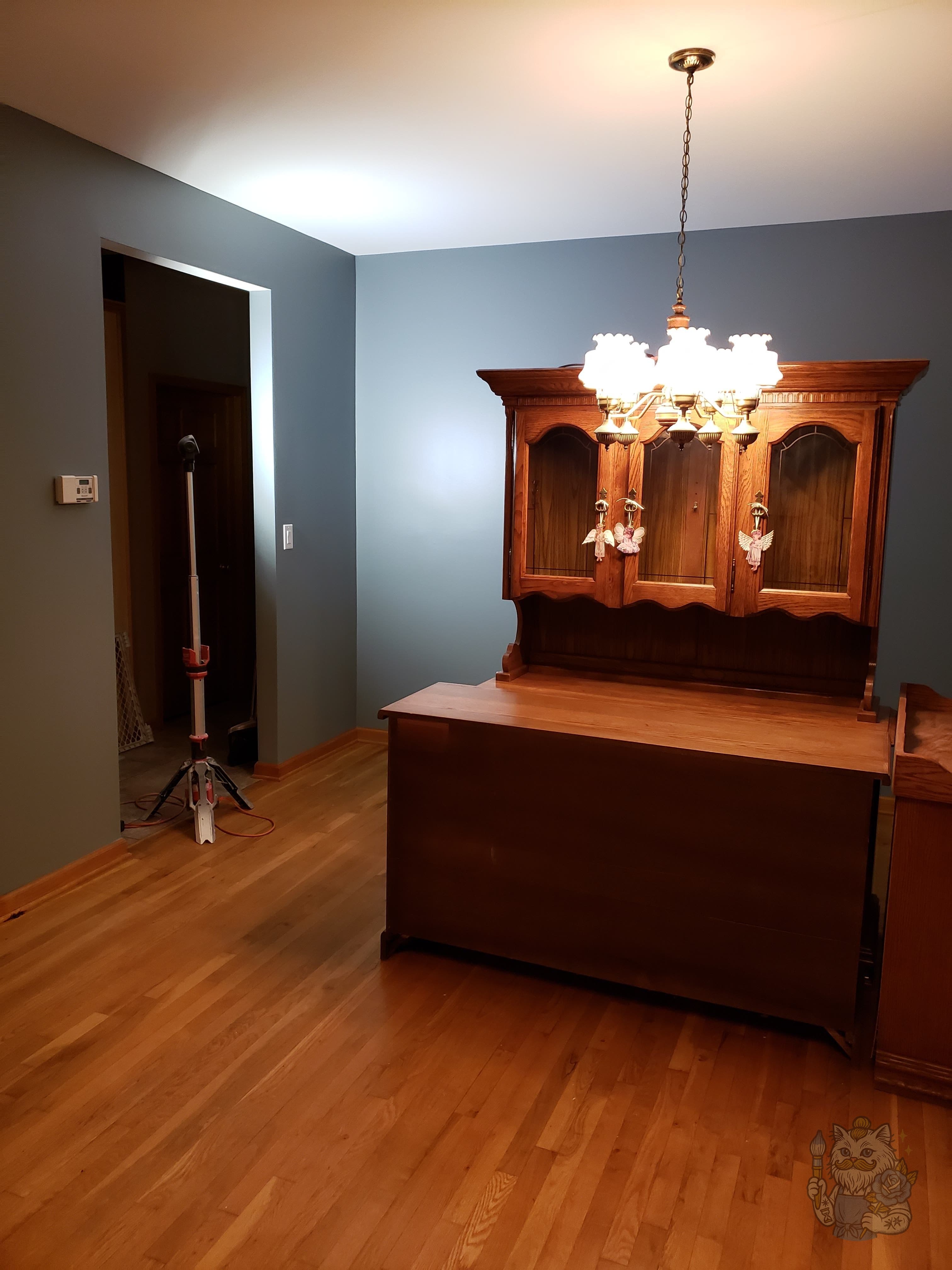
No. 01 · #5E7185
Warm, grounded blue-gray. Works in dining rooms, libraries, and north-facing spaces where you want depth without going moody. The dining room shown here was a full repaint in this exact tone.
Real finished job
A small, opinionated set of colors that read well in Monmouth and Ocean County houses — and how they look in real finished rooms, not on a manufacturer's swatch card.
Warm, grounded blue-gray. Works in dining rooms, libraries, and north-facing spaces where you want depth without going moody. The dining room shown here was a full repaint in this exact tone.
Real finished job
Muted, natural green. Reads earthy without being trendy. Good for living rooms, primary suites, and powder rooms. Pairs cleanly with both cream trim and natural wood.

Real finished job
Clay-rich orange. Earthy without being loud. Strong in dens, accent walls, sun-filled rooms, and entries that want some warmth from the moment you walk in.

Real finished job
Deep, grounded brown. The right richness for moldings, accent walls, or full library treatments. Quiet but confident.
Real finished job
Warm off-white. The safest reset and the most forgiving choice across changing light. Reads softer than pure white in any room.
Real finished job
Soft warm neutral. Pairs with most trim colors. Works in hallways, tighter rooms, and anywhere you want a calm wall that doesn't fight the furniture.
Real finished job
I'll bring sample boards to the estimate and walk through what works for your light, your trim, and your furniture. No pressure.